Master Tennis Canada Brand
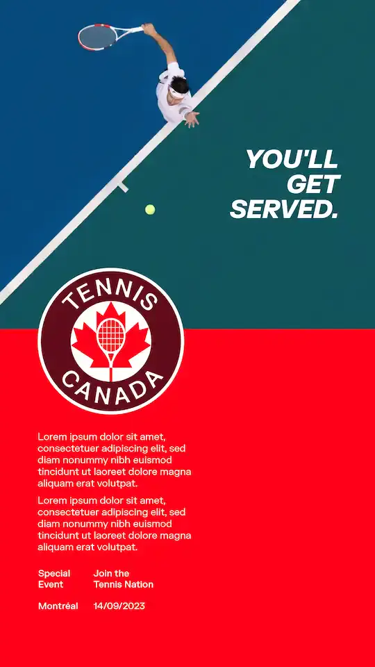
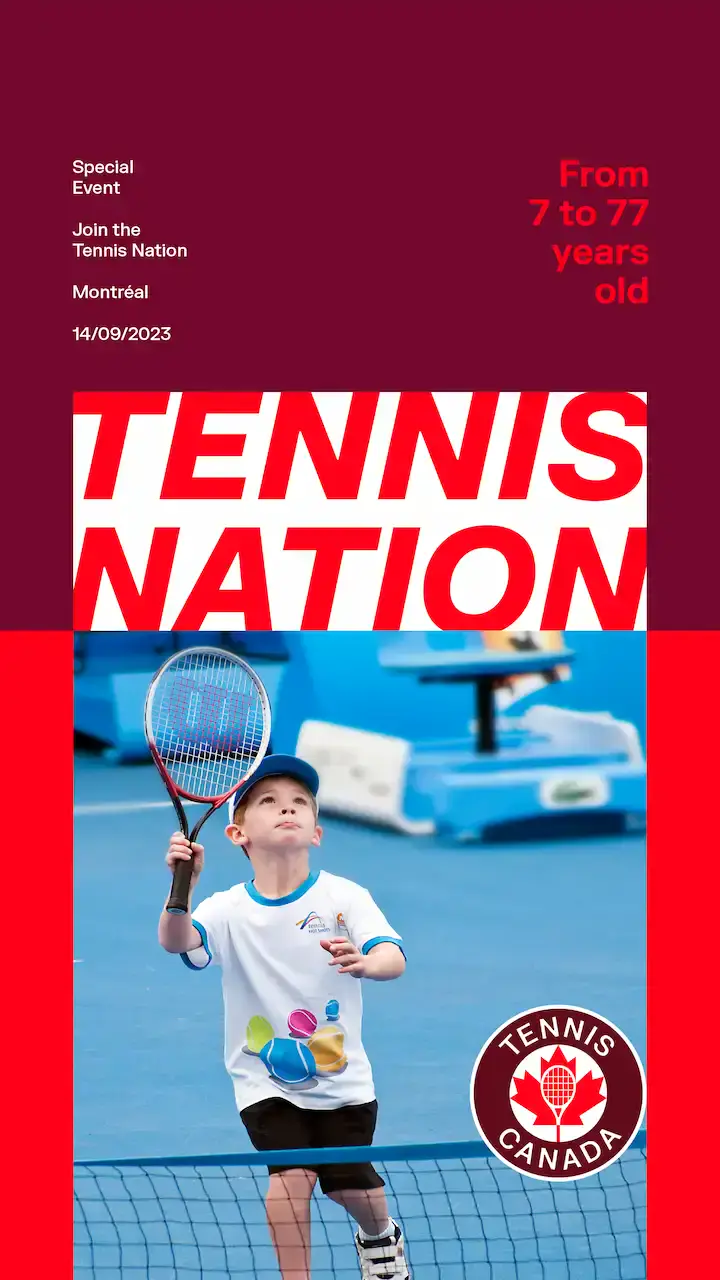
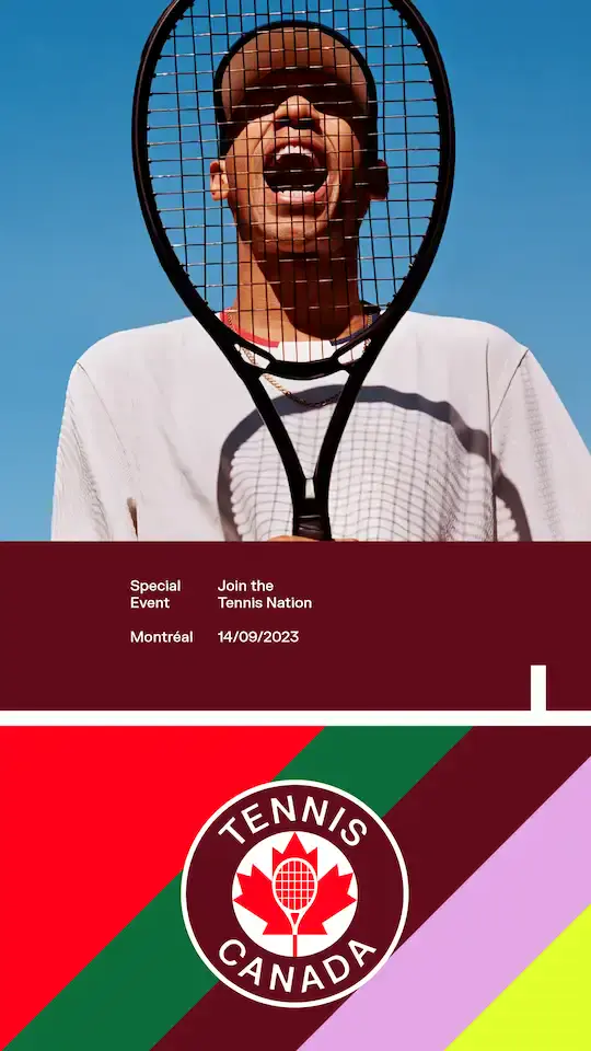
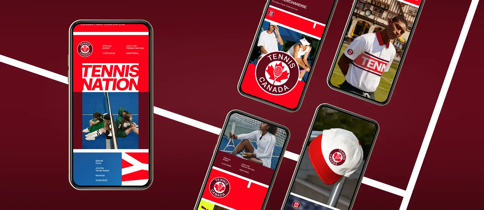
Here are our brands visual elements, from colour palettes to photography, that brings life into the Tennis Canada brand.
The master brand refers to creative that does not feature a program and focuses on Tennis Canada as a whole.
CORE BRANDS
Tennis Canada has many great programs under our brand which are referred to as our sub-brands, here are some examples for how to execute creative when we have two logos included - both a program logo and our official Tennis Canada logo.
Note that the Tennis Canda logo should always be visible.
There are two options for execution:
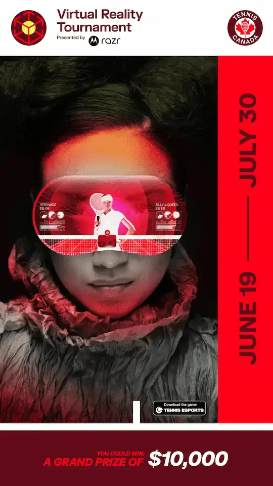
1. Including the program logo and TC logo at the top on a white bar to ensure it is obvious this is a Tennis Canada initiative.
2. Including the program logo elsewhere on the creative but in this case the TC logo should be bigger to ensure it is clear that it is a Tennis Canada program.
Shared Brands
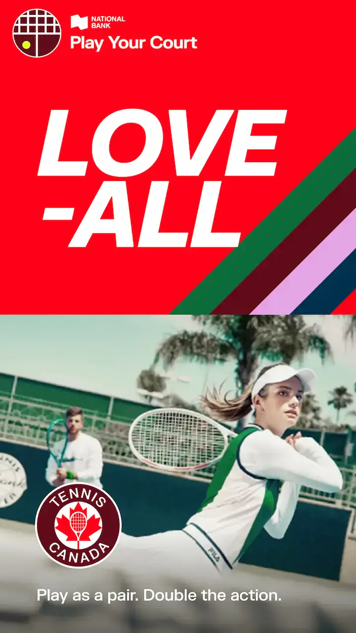
Some of Tennis Canada's programs are supported by our great sponsors, which also fall under our sub-brands. Here are some examples of how we execute creative when we have sponsor logos included.
Note that the Tennis Canada should always be visible in this layout as well as the program logo on white to ensure the sponsors logo is readable (some exceptions apply for unique layouts).
