Logo
Official

Our Official Logo

This logo represents an evolution of the existing one, with the intent of refreshing its design while preserving its original key features.
Canadian inspired red, with a more vibrant note.
The maple leaf is a nod to our Canadian heritage, and the tennis racquet is more predominant.
It's important to use the entire logo, including the white border, even if the background is white.
Download our LOGO

BLACK & WHITE LOGOS

The official black and white versions should only be used in situations where using the color version is not possible.
Ensure that readability is optimized by selecting either the white or black version based on the context.
Download B/W LOGO

HORIZONTAL LOGO

The horizontal logo is used when space constraints affect readability.
Special approval from Tennis Canada is required due to its exceptional use.
Download horizontal LOGO

SAFE SPACE AND MINIMUM SIZE

The safe area around the logo is equivalent to the height of the letter «I» in the word TENNIS.
The logo's minimum size is 0.75 in.

INAPPROPRIATE USES

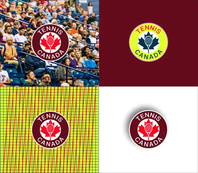
Don't alter or modify the original Tennis Canada logo. Any unauthorized changes can dilute the brand's identity and create confusion among users.
• Don't put over crowded photos or busy background.
• Don't use the old Tennis Canada logo.
• Don't scale, crop, rotate.
• Don't remove, add, or modify colours and elements.

PARTNERSHIP LOGO LOCK-UPS

Using the letter «I» from the logo of Tennis Canada as a measure unit;
This is the way to build up the lock up for 2 logos.
• Don't modify the margins assigned by the brand.

OFFICIAL PARTNER TENNIS CANADA LOGO

Here's the logo created to feature on our partners's communications.
• Don't modify the margins asigned by the brand.